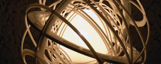
Throwback Thursday: Getting Ready for Take Off
In the summer of 2009, the first version of i.materialise was ready. One month before going live, we tested the whole process of support, file fixing, production and logistics on 700 Materialise colleagues worldwide. This alpha test invited everyone to print one project for free and it taught us a lot about running an online 3D printing service.
The idea was simple: get your idea printed in any technology you want (which was available at that time). It didn’t matter if it was a lamp, a puzzle or an architectural model, we would print it… The only thing we asked in return was the story behind the model. Sweet deal, right?
Software
During the one month trial, we also learned a lot about 3D design software or the barrier to design. I remember someone telling me his favorite design software was MS Paint but unfortunately it didn’t have a 3D design option.
In 2009, there was no Tinkercad or a 123D Design. People here used AutoCAD, SketchUp, Rhinoceros, Cinema 4D, Maxima, Blender, 3-matic, Magics and Excel. Yes, someone called that a design software too. Turned out that, for a lot of colleagues, Materialise’s high-end software like Magics and 3-matic was also a great to achieve their goals.
Applications
Eager to see what people would be creating, a few categories quickly began competing for the title of most submitted designs:
- Architectural Models: It almost seemed like everyone was doing renovations in 2009 or busy constructing a house. What better way to visualize a future home than to draw it in SketchUp and have a 3D printed version of it?
- Mathematical Models: Having a lot of colleagues with a background in Mathematics, we ended up seeing all kinds of fractals, Sierpinski sponges and Tesser cubes.
- Lamps: The .MGX by Materialise collection inspired the majority of colleagues to see if they could also design something that creates the mood and brings magic to any setting.
- Spare Parts/Functional Models: Whether it’s fixing what you broke or replacing missing parts, we helped people from making that board game from the 80s complete again to fixing the guardrail of the stairs a bit safer.
- 3D Lithophanes: A great way to add an extra dimension to photographs was turning them into a Lithophane that can be seen clearly when back lit with a light source. For over 10 years, Magics software has a great functionality for that: Create from bitmap.
An interesting fact back then was that we printed almost no jewelry or iPhone cases. Of course , i.materialise didn’t offer precious metals yet in 2009 and 3D printed phone cases only took off after the iPhone 4 was released in 2011.
My 3 Favorite Projects
With so many submissions, it took me a while to select my three favorite projects that were printed during the trial, but I managed to find a quirky IKEA hack, an armillary sphere and a lamp with an ingenious mechanism.
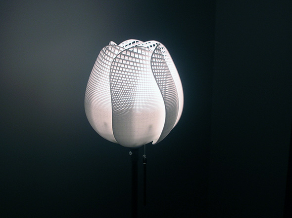
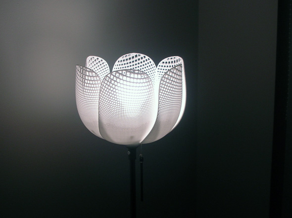
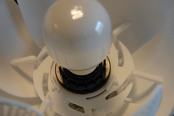
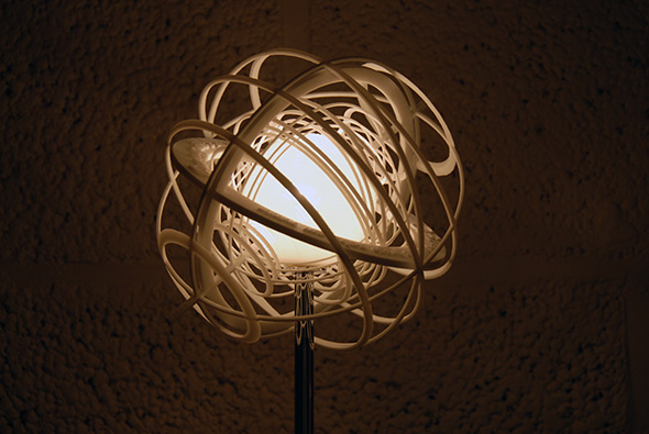
TulipK by Ben Geebelen
Ben Geebelen’s TulipK lamp was printed in polyamide. The pattern of the lamp was designed in Excel and the file was prepared in 3-matic. The lamp opens and closes through an ingenious mechanism that acts as a 3D printed dimmer for the lamp. According to Technabob, it was the best use of a spreadsheet since Excel Pac-Man and Missile Command.
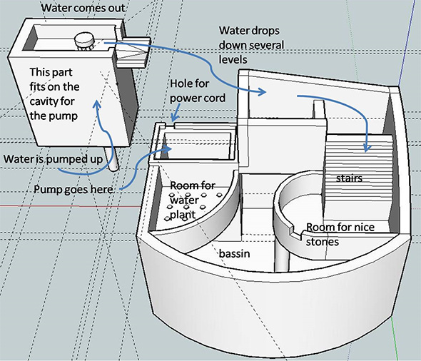
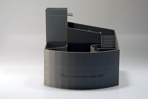
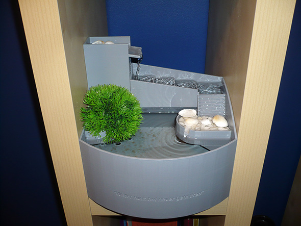
Indoor Fountain by Erik Boelen
The oddest looking thing we printed was submitted by Erik Boelen from the Mimics team. Erik never designed something in a design software from scratch, but he liked the challenge and started to play around with SketchUp. He worked a number of evenings in SketchUp and lost track of time every time. It was printed in ABS and perfectly fitted his Billy bookshelf. Without realizing, he might have just come up with a quirky IKEA hack.
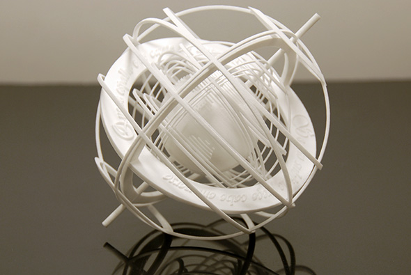
Armillary Sphere by Patricia Lopes
As a Portuguese girl living abroad, research engineer Patricia Lopes, wanted to create an object that symbolized her country. Since the rooster was a bit too kitsch, she decided to design a far more visually appealing and technologically demanding symbol: the armillary sphere.
The armillary sphere represents the celestial space and was used as an astronomical instrument by the Portuguese discoverers. It is currently part of the Portuguese flag. Being fascinated by astronomy, this seemed a good way to start. But how do you create a modern design based on such an old object? Well, she found inspiration in one of her favorite artists: Escher. The result was an intertwined set of spheres.
The final touch was an excerpt from “Os Lusíadas”; an epic poem about the history of Portugal. Roughly translated, it says “It shall be spread and sung in the Universe. If such a deed can be described in verse”.
If you could print anything you want, what would you print? Let us know in the comments.
Recommended Articles
No related posts.


